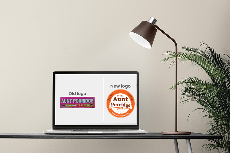
Forna Health Foods ltd, the proud producers of Aunt Porridge, is happy to announce the launch of the new logo as part of the ongoing brand evolution.
Our professional profile has grown and evolved over the last 7 years, and now it is time for a change. We have improved our logo to reflect who we are today and to symbolize our dynamic future.
Basically, the new logo crystalizes the Name “Aunt Porridge” as the company’s most popular identification label. Also, the new design of the outside frame is meant to improve the readability of the full name.
The stars represents the mystery of Ratings are based on:
- Total energy (kilojoules)
- Saturated fat, sodium (salt) and sugar content. Consuming too much of these risk nutrients is linked to being overweight and obese, some cancers, heart disease and type 2 diabetes.
- Fibre
Symbolically, the framing circle becomes borderless to create the impression of a whirling cycle that denotes ongoing dynamism.
Proud as we are of our rich history and deep roots, we retain the logo’s core elements, wreath, 5 stars and the image of a mother with a baby.
The managing director, Angela Nabweteme, says a new logo is just a visible sign of the dynamism going on in the company.
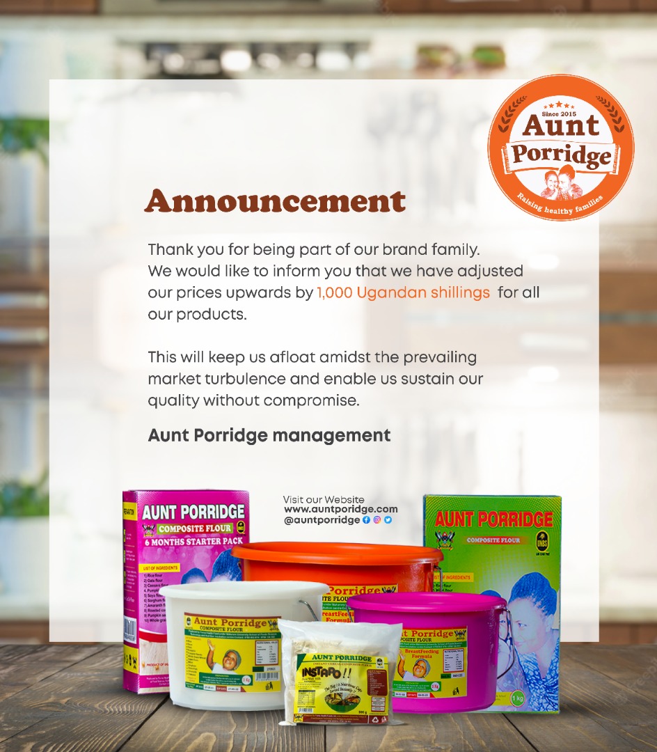
Aunt porridge